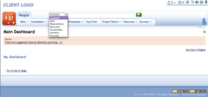
This is an example of redesigning a Software as a Service from the ground up, starting with the navigation. The challenge here was that there were multiple modules within the application that were all developed and designed differently and each had their own set of navigation points. This meant that as a user made his way through the system it was difficult to keep track of where they were and how they got there.
Through user research, I learned that users often used options across all modules during a single session. Additionally, users had a hard time navigating the system and finding what they needed when they needed it. Thus, I redesigned the system so that it was user-centric rather than module-centric. Here are examples of the new navigation system I designed both the visuals and interactions for compared to the original one. All of the work for this was completed in Adobe Photoshop. The screens you see below are from the released product.
HRSmart has since been acquired by Deltek.
Click on the images to view them.
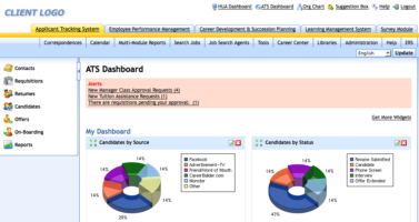
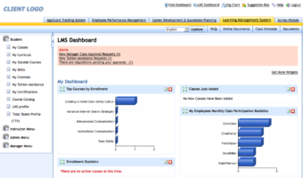
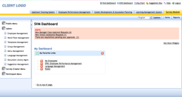
- Original look and feel with all of the modules provided individually.
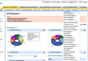
- Original vertical menu that has been expanded, which changed depending on what module you were in.
- Original individual Module with an additional menu visible.
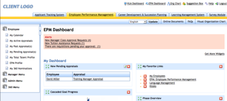
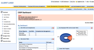
- Original individual Module with its own navigation.
- Original individual Module with its own navigation.
- Original individual Module with its own navigation.
- Original individual Module with its own navigation.
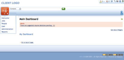
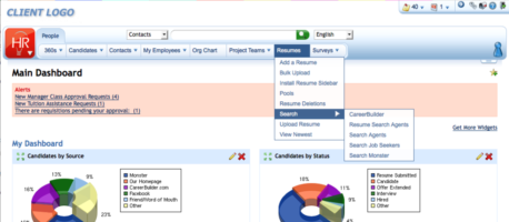
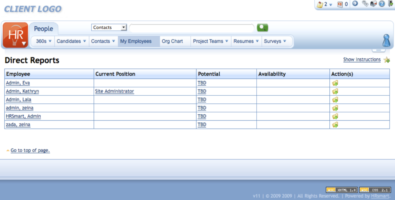
- Simplified Navigation on Log In with top level nav items, utility menu, and user menu.
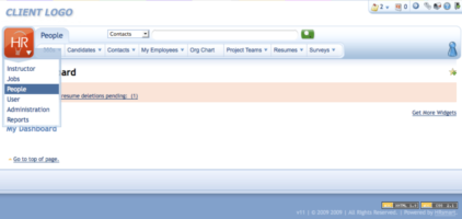
- Hovering 1st level navigation option reveals 2nd level navigation options. Once 1st level is selected the vertical menu goes away. It is easily accessible again via the logo.
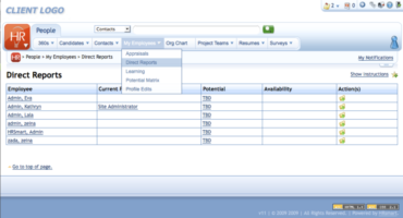
- An example of the third level nav options. In the original system, this would have taken an upwards of 8 to 10 clicks to get to everything at this level. Here it is reduced to 2.
- This is an example of the navigation that shows multiple modules accessible from a single nav point.
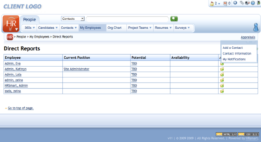
- The system provided both hierarchical and navigational breadcrumbs. This helped with wayfinding and learning the system.
- To avoid taking up vertical space, the breadcrumb bar (which shows both hierarchical and navigational breadcrumbs) can be collapsed and its position is stateful.
- To help users learn the new system as well as wayfinding, the menu of the location where the user is currently located is highlighted.
- Search from each module was consolidated into a single one. This was step one of a future process where the searches from each would be combined so that the dropdown would be unnecessary moving forward.
